How Peak Performance Harnesses Color Psychology to Create Enduring Designs

Author Photographer
  • Courtesy Peak Performance

How Peak Performance Harnesses Color Psychology to Create Enduring Designs

In embracing natural hues inspired by Nordic landscapes, the Swedish mountain brand lets its design and outerwear performance do the talking


Published: 10-16-2025

About the author

Field Mag Studio
Field Mag Studio
FM Studio creates original content in partnership with like-minded brands.

Presented by


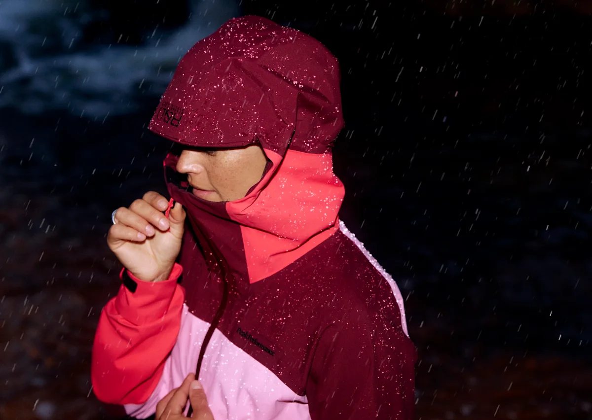
When Swedish mountainwear brand Peak Performance entered the scene in 1986, outdoor apparel was awash in bright neon hues. Rather than adopt the cultural zeitgeist’s preferred palette of highlighters, the brand made a purposeful decision to create a color theory of its own in embracing the softer shades of the founders’ hometown of Åre, set between the shores of Åresjön lake and the 4,660-foot mountain Åreskutan.

Beyond defining the identity with a clear visual look, the decision embodied Peak’s mission as a brand founded by two backcountry skiers making quality skiwear that lasts, using colorways as enduring as the northern landscape itself. Nearly four decades later, the approach remains a defining characteristic and a key differentiator for the brand.

“That early vision still defines us,” says Sofia Gromark, Peak Performance Creative Director. “Peak’s identity today is built on a balance: functional design rooted in Scandinavian nature, expressed with a modern and sophisticated use of color.”

outdoor-rec-archive-peak-performance-1995

Peak Performance 1995 catalog. Courtesy Outdoor Rec Archive

outdoor-rec-archive-peak-performance-Spring-1996-Gore-Tex-Jacket

A Gore-Tex jacket from the Spring '96 collection. Courtesy Outdoor Rec Archive

Using Color to Create a Brand Identity

While it may seem superfluous, Peak employs color as a throughline in the form, function, and feeling of each product. Just as each person sees their own line to ski down the face of a mountain, we all perceive color differently, too. It's based entirely on the interaction of light with our eyes and brain. That's the basis for color psychology—while some hues summon a response that’s nearly universal (i.e. red equals danger), many can evoke an entirely subjective and even subconscious emotional and behavioral response linked to our memories and associations established over time.

Sweden is, naturally and culturally, understated. So a subtler color palette that matches only makes sense. By bucking the neon trend of the 1980s to focus on earth tones and hues rooted in the natural landscape, Peak has established a certain enduring aesthetic that wears well in the present and will remain relevant for eras yet to come. Leaning into color blocking and intentional moments of contrast has allowed a sense of playfulness to enter the designs while building a recognizable identity, too.

“You should be able to call out a ski jacket from Peak Performance from 100-meter distance without even seeing the logo,” says Elin Andersson, the company's color lead. “We should always be strategic in our contrasts. Because when bold colors appear we make sure to explore the balance between feeling surprised but at the same time grounded.”

Peak-Performance-Color-Story
Peak-Performance-Elin-Andersson-Ski

Courtesy of Peak Performance

Peak Color Theory In Play

The brand’s new FW 2025 line of Helium down jackets illustrates how the brand puts color theory into practice with a three-in-one color story that, Andersson says, portrays a day on the mountain through the changing light from dawn to dusk.

One set of colors, dubbed "The Morning Blast," includes a deep red-orange, burgundy, and pale peach that represent the warm glow of an alpine horizon at first light. Another called "Afternoon Leftovers" features a crisp green, while a final set dubbed "Coming Home Too Late" includes steely grays and blues drawn directly from a winter landscape at dusk.

"We all know the colors of a sunset," says Andersson, "but to translate them into fabric is almost impossible. Nature is alive; it shifts and never repeats itself." A wine-like purple called Vertical Zenith and a red-orange called Solar Burst are, according to her, as close as the brand has come to capturing it. "That living, fleeting phenomenon—the warmth, the brilliance, and the quiet intensity of a mountain sunset."

You’d be right to think that these color stories sound a lot like, well, a story. “For me, we are—and have always been—a brand that tells stories. And to tell a good story you need a good plot,” said Anderrson. “But a good plot is nothing without its vivid descriptions or something else that catches the recipient’s eye. This is how I see our way of using color as something that brings our products to life.”

Peak-Performance-Helium-Down-jacket

Courtesy of Peak Performance

Merging Fashion, Form, and Function

Beneath color, the core of Peak Performance outerwear and apparel is functionality. "For us, function isn’t an aesthetic—it’s a necessity," explains Gromark. "Historically, Sweden was a poor country with a harsh climate, which meant that whatever we made had to last, perform, and serve a real purpose. That tradition has shaped Scandinavian design ever since."

In the Helium line, a range of styles and silhouettes including the Helium Utility Down Jacket and Down Vest feature Peak Performance's signature eye-catching curved baffles—a design inspired by the curved tracks skiers leave in fresh powder—with toasty 700-fill power insulation to trap warmth. Each piece has the kind of built-in durability you want and need from skiwear, like breathability, packability, and strong wind and water repellency. Spend as much time in nature as the designers at Peak Performance have, and the basic elements of functional design—the kind that can’t be faked—become a lot easier to define. In the mountains around Åre, itself three degrees shy of the Arctic Circle, function is synonymous with survival.

Peak-Performance-Color-Theory-Hero

Courtesy of Peak Performance

But Peak Performance exists in modernity too, and a love for skiing and the mountains has been part of the brand's ethos since those early days in the '80s. That's where color comes in. Layered onto the company's well-formed foundation of functionality, apparel that's designed to be practical can also achieve a necessary touch of personality. Through color choice and strategic contrast, as in the Helium collection's color blocked pockets, outerwear can become playful and bold.

By focusing on both, Peak Performance is able to make gear that lasts well beyond the next season, and the next trend cycle. The team isn't worried about any lack of inspiration; Åre and its nearby "mother mountain," Åreskutan, are a constant source of inspiration. "Not only for those rare, perfect days, but all year round," says Andersson. "It’s a living mountain that continues to evolve, surprise, and inspire us season after season."

LEARN MORE

Dive even deeper with our guide to 30+ of the most influential Scandinavian outdoor brands.